2016-12-16

Rogue One Review

Last night Katie and I attended the opening night of Rogue One and, long story short, I liked (didn't love) it. It started off pretty weak - I was actually fighting to stay awake for the first act of the movie - but finished really strong. Overall I would give it three stars out of five for some serious weaknesses but also some epic wins that are simply not to be missed by any Star Wars fan.

Following are some more detailed thoughts but WARNING: THERE BE SPOILERS BELOW!

THE GOOD
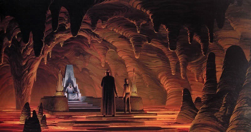
  • The best part of this film hands down was Darth Vader. I loved that we had a glimpse of his lair  (which reminded me of the early concept art for Palpatine's throne room - see below) and I got chills during the finale as he effortlessly crushed rebel peons. It's the most menacing we've seen him since the opening scene of Episode IV - really well done. Some people have complained that we don't get enough of him in this movie but sometimes less is more and I think this is one of those times.

  • The action sequences were really good. I enjoyed both on the ground fight scenes as well aerial battles.
  • The visual effects were seamless and stunning. The filmmakers clearly had a commitment to continuity such that the design of everything from uniforms to spacecraft was quite in line with what we saw in Episode IV. Still, seeing those same, familiar designs rendered in today's technology and displayed in IMAX 3D was quite spectacular.
  • Along the same lines, the motion capture was really good. Characters like Tarkin were photorealistic and looked convincingly like Peter Cushing circa 1977. Bravo, effects team!
  • There were many new worlds and creatures in this movie and, although no time was devoted to their development, it was nice at least to see attention paid to such creative efforts that expand the universe - er, galaxy.
  • Plenty of attention was paid too to numerous details. For example, when the rebels arrive on Scarif, they are assigned a landing pad far away from the citadel. When Director Krennic arrives, however, he gets a rockstar parking spot exactly as you would expect. Small details like this make the movie more believable and more immersive.
  • With a female primary protagonist working closely with a male secondary protagonist, the temptation was strong, I'm sure, to force them into a love arc but I was pleased that the filmmakers didn't give in. The movie implied that there was some romantic tension there by the end but didn't give them a contrived kiss before dying. Indeed, young, good looking people can save the galaxy without becoming completely sidetracked by hormones. Thanks for that! 
  • I liked that this was darker than many other Star Wars movies. They necessarily had to kill off all of the protagonists and they did so rather than finding some hand wavy explanation for them not being in the "subsequent" films.

THE BAD

  • All that said, there were some serious flaws in this movie. The most egregious of which was the lack of characterization. They introduced a number of new characters but did a poor job of developing them. Many of the characters were cool and interesting - like Donnie Yen's Chirrut Îmwe - but I found myself not really caring when they died. K-2S0, mo-capped brilliantly by Alan Tudyk, was the one I found myself caring the most about and he was a bloody droid!
  • The characters also had sudden and unbelievable 180 degree turnabouts - e.g. Cassian all of a sudden being behind Jyn and Jen all of a sudden being rah rah Rebellion. These felt to me much more like cheap plot conveniences rather than earned transformations during a character's journey.
  • There was no compelling antagonist. Krennic was the primary villain and he just wasn't very . . . threatening. He didn't give me any sense of dread or foreboding that our protagonists were in danger.
  • The lack of characterization of both heroes and villains made most of the tension in the film feel manufactured. Krennic inexplicably follows the rebels personally instead of getting the hell outta Dodge on his shuttle? Yawn. Jyn and Cassian have a passionate discussion about losing everything to the Empire? Yawn.
  • Our protagonists also seemed to gain and lose superpowers whenever convenient for the plot. They struggled to traverse slippery rocks around the Imperial research facility but then performed death defying leaps, grabs, and climbs in the data vault. That aspect of the film felt like on demand Mary Sue / Gary Stu.
  • I can't attribute the lack of characterization or all the plot conveniences to underinvesting in setup up front. In fact the first act of the film had a lot of exposition and laying of narrative foundation - but it was ineffectual and, frankly, boring. I found myself fighting off sleep for the first 45 minutes or so of the film.
  • The plot also felt very choppy in parts. For example, Jyn receives a hologram from her father and then subsequently actually meets her father and talks to him in person. Or Jyn determines that Cassian is going to kill her father and then, half an hour later (theater time), confronts him about it. They aren't plot holes per se; they just seem narratively wonky and I suspect that they are symptoms of made-by-committee cuts, reshoots, and reshuffles.
  • Much of the film's appeals to emotion are pretty heavy handed. The humor worked for me more often than not but, for example, there was a scene in which they put a bag over Chirrut Îmwe's head. Because he is blind, that's funny in a subtle way but they cheapen it by having him point out the irony explicitly. Similarly they overtly go back to the "hope" well over and over again in monologues, making for a much less elegant segue to Episode IV: A New Hope than what could have been.

THE UGLY

  • Some of the acting is just plain bad. There's an informant with an injured arm who is just terrible and Forest Whitaker really fails in his attempt to bring something interesting to his character. Much of the acting was top notch but some of it was conspicuously bad. 
  • There were also a number of Easter eggs in the film. Some of these were fine but some - like the two thugs from Episode IV's Mos Eisley Cantina scene bumping into our protagonists on Jedha - were ridiculous. I know they're trying to provide fan service here but, when we keep bumping into the same characters on just a few planets out of the entire galaxy, it serves to shrink the universe and seems utterly contrived.
Despite some serious shortcomings, the film was an overall positive one for me. Unlike The Force Awakens, I probably won't see it several times in the theater but I may go back once more just to see Darth Vader in all his glory again. Some people like this film more than others but it is definitely a must-see for any fan of Star Wars.

2016-11-06

Has Obama Changed the Economy for the Worse? Conclusion

Over the past three weeks I have evaluated nine specific claims made by an article purporting to show that "Obama has changed the face of our economy for the worse." The article was presented to me as definitive proof that Obama has been "a train wreck" as President of the United States.

Of the claims and sub-claims, some of them have merit (2), some of them are technically true but don't actually support the conclusion they are meant to (4), and some are patently false (7).

I would encourage readers to go over each of the claims and my investigations of the but the exeuctive summary is that America under Obama really hasn't changed much during Obama's administration. Using these metrics you certainly can't conclude that Obama is "a train wreck." Given that these metrics were cherry picked to support exactly that conclusion, it is entirely possible that, choosing other metrics, you might even be able to conclude that Obama is "better than a train wreck."

If nothing else, this investigation should be a reminder to apply CRITICAL THINKING to "data" and "facts" with which you are presented - the "facts" presented in this article were mostly false and/or misleading. Nearly everything we see has been filtered through an agenda lens and is tainted with selection bias and interpretation bias. Given that we will each apply our own cognitive biases to information, it is crucial that we get as close to the unadulterated source material as possible.

My suggestion - especially as we head into election day - is to question what you read. If there are no links to sources, that is often an indicator of fabrication/manipulation so your BS radar should be at high alert. If there are links to sources, don't assume that those sources support the conclusions or interpretation of the article you are reading - quite often (This article was a case in point!) they don't.

If your reaction is that this all sounds well and good but you just don't have time to do that kind of research then I challenge you to examine your priorities - what could be more important than being informed as a voter in an election year? As Dumbledore would say, "We must choose between what is easy and what is right."

Choose what is right.

2016-11-05

Is trust in Obama's leadership at historically low levels?

As part of my series analyzing the article suggesting that Obama has changed the economy for the worse, let's now move on to the ninth and final claim: that trust in Obama's leadership and administration remains at historically low levels.

Cutting right to the chase, I can't find any support for this claim. I suppose it depends on what the writer means by "trust" but the nearest metric I can find is presidential approval ratings.

Across 10 polls, Obama is currently ~53%, which is much higher than his lowest approval rating (37% in 2011 and in 2014):


Obama's current approval rating is also higher than every other president's lowest approval rating since Kennedy:


Obama's approval rating is neither low within the historical context of his presidency nor within the context of all presidencies. Therefore this claim is FALSE.

That said, Obama's average approval rating (47%) is the lowest since Carter's and is on par with that of W, Carter, Ford, Nixon, and Truman - not the best of company. I'm not sure, though, if it's fair to compare approval ratings of today's polarized, partisan media-driven, post-fact world with those of a simpler time when people got their information with less spin and did more thinking - and approving - for themselves.

CONCLUSION: This is a baseless claim with no substantiation whatsoever.

2016-11-04

Was America's credit rating downgraded for the first time ever under Obama's watch?

As part of my series analyzing the article suggesting that Obama has changed the economy for the worse, let's now move on to the eighth claim: that America's credit rating was downgraded for the first time ever under Obama's watch.

Yes, America's credit rating was downgraded from AAA to AA+ by S&P in 2011 so this claim is TRUE. The downgrade followed a record high deficit and public debt (See previous discussion.) but the actual reason for the downgrade was perceived risk that the government would default on its debts due to political posturing.

From S&P's Downgrade Announcement:

"More broadly, the downgrade reflects our view that the effectiveness, stability, and predictability of American policymaking and political institutions have weakened at a time of ongoing fiscal and economic challenges to a degree more than we envisioned when we assigned a negative outlook to the rating on April 18, 2011. Since then, we have changed our view of the difficulties in bridging the gulf between the political parties over fiscal policy, which makes us pessimistic about the capacity of Congress and the Administration to be able to leverage their agreement this week into a broader fiscal consolidation plan that stabilizes the government's debt dynamics any time soon."

and

"The political brinksmanship of recent months highlights what we see as America's governance and policymaking becoming less stable, less effective, and less predictable than what we previously believed. The statutory debt ceiling and the threat of default have become political bargaining chips in the debate over fiscal policy. Despite this year's wide-ranging debate, in our view, the differences between political parties have proven to be extraordinarily difficult to bridge, and, as we see it, the resulting agreement fell well short of the comprehensive fiscal consolidation program that some proponents had envisaged until quite recently. Republicans and Democrats have only been able to agree to relatively modest savings on discretionary spending while delegating to the Select Committee decisions on more comprehensive measures."

This is akin to a credit agency reducing the rating of a married couple. They have good incomes but they also have significant spending, which would be fine but all they do is argue instead of presenting any real plan for repaying their mortgage.

CONCLUSION: Yes, America's credit rating was downgraded during Obama's administration - but the fault lies with both parties and especially in Congress. I hope everyone remembers how Congress (both parties) failed us in this incident when choosing to vote for/against congressional incumbents this election day.

2016-11-03

Was there a record number of home foreclosures under Obama's presidency?

As part of my series analyzing the article suggesting that Obama has changed the economy for the worse, let's now move on to the seventh claim: that there were a record number of home foreclosures during Obama's presidency.

This one is pretty easy to research. According to these data from RealtyTrac and the Federal Reserve, indeed there was a record number of home foreclosures during Obama's first term so this claim is technically TRUE.

However, the author uses the claim to imply that the foreclosures are evidence of Obama's failure in economic policy. However, the record number of foreclosures began during the mortgage crisis, long before Obama even took office since the end of the crisis there has been a downward trend such that we are now back to pre-crisis levels:


Fore a detailed breakdown of foreclosure trends, see this report from RealtyTrac.

CONCLUSION: Yes, there was a record number of foreclosures during the worst mortgage crisis in history (duh), which began long before Obama took office. Now we're back to pre-crisis levels of foreclosures.

2016-11-02

Are nearly 50 million Americans on food stamps?

As part of my series analyzing the article suggesting that Obama has changed the economy for the worse, let's now move on to the sixth claim: that nearly 50M Americans are on SNAP (food stamps).

According to the Food and Nutrition Service, ~43M Americans (~13% of population) are on SNAP.
This number (both absolute and percentage) has been declining steadily since it peaked ~48M (~15%) immediately following the recession. It seems like a real stretch to call 43M "nearly 50M" so I suspect the author is either sensationally rounding up and/or intentionally using years-old figures because they better fit his narrative. As such, I rate his claim FALSE.

Still the absolute number and percentage are much higher than historical norms - 10 years ago only ~27M Americans (~9% of population) were on SNAP - so why is that?

Analysis by the Congressional Budget Office suggests that ~20% of the increased enrollment in SNAP is due to expanded coverage introduced during the first month of Obama's presidency but that the remainder is due to the economy. The CBO projects that SNAP enrollment will return to pre-recession in ~6 years:


Note that this CBO analysis is from 2012 - but that the number of SNAP participants has indeed fallen as predicted since then.

CONCLUSION: SNAP enrollment increased during the recession and in accordance with expanded coverage in the American Recovery and Reinvestment Act. It is now falling to pre-recession norms but slowly. Given the previous evidence of the general health of the economy and job market, I would conclude that the aftermath of the recession is disproportionately affecting lower-income Americans.

2016-11-01

Are 46 million Americans Living in Poverty?

As part of my series analyzing the article suggesting that Obama has changed the economy for the worse, let's now move on to the fifth claim: that 46M Americans are living in poverty,

First off, what does it mean to be "living in poverty?"

According to the Census's most recent data (2015), to be living "in poverty" a household must have income below:
$11,770 for 1 person
$15,930 for 2 people
$20,090 for 3 people
... and so on.

As a quick aside, let's note that, in many parts of the world, "poverty" is defined as living on less than $1/day so let's take a step back and give tremendous thanks that we live in a country in which our poverty line is orders of magnitude higher than that. This in no way takes away from the plight of the US's lowest earners - but it does remind us how blessed we are even to be here.

Back to work, though, how many Americans are living in poverty according to this standard? In 2015 13.5% of Americans (43M) were in poverty. 43M is less than 46M so the claim is FALSE.

Still, 43M and 13.5% both sound alarmingly high to me so let's look closer at what these figures really mean. 13.5%, it turns out, is in line with recent historical norms.13.5% is a greater percentage of Americans living in poverty than 10 years ago (12.6%) but has been steadily declining since the recession - a good trend.


As one writer points out, though, these Census figures are a little misleading as they measure the number of people who would be in poverty without government assistance (through SNAP - food stamps - and tax credits), rather than those who are literally living in poverty. By his calculations, the percentage of Americans actually living in poverty is ~3.5% (~11M people) while the other ~10% are being buoyed out of poverty through government assistance. Obviously there is a debate about whether such assistance helps lift people permanently out of poverty, does nothing, or contributes to people staying in poverty.

CONCLUSION: the number of people actually living in poverty isn't as high/alarming as it sounds at first blush, but that's only due to assistance from the government. This seems to have been the case for some time without much change over the last decade. I, for one, would rather see investments in programs aimed at addressing the systemic causes of poverty rather than just helping those already in poverty to stay afloat. Such programs may already exist but I would question their efficacy given the low change in poverty rate over the last decade and I would support experimentation with new approaches.

2016-10-31

Has Obama Accrued More Debt Than All Other Presidents Combined?

As part of my series analyzing the article suggesting that Obama has changed the economy for the worse, let's now move on to the fourth claim: that Obama has accrued more debt than all other presidents combined.

When Obama took office January 20, 2009, the national debt was $10.626T(!). As of September 30, 2016, the national debt was estimated to be $19.4T. So it is accurate to say that, while Obama has been in office, the national debt has increased $9.2T, nearly doubling(!). By definition that isn't as much as all previous presidents combined ($10.626T) so this claim is FALSE.

Of course, that's a pretty goofy yardstick against which to be measuring anyway since inflation and GDP influence the relative magnitude of the debt over time and some presidents have even reduced the debt with budget surpluses. Still, it's worthwhile to take a look at our federal debt as one indicator of our governmental spending/health. After all, $9.2T is still an epic amount of debt to accrue over 7 2/3 years.

It's not entirely fair to chalk the entire $9.2T up to Obama, though, because each president inherits the budget of the previous president during his first 9 months in office. A fairer comparison is to look at the sum of budgetary surpluses an deficits for which the president (and Congress) have been responsible. A good summary of Obabma's deficits pegs him as presiding over ~$7T in deficits - still a record by far  and ~2x that of his predecessor, W, who presided over ~$3T of deficits.

Since the President and Congress negotiate the budget together each year, it is perhaps even more instructive to look at the costs of a President's specific policies. According to this quora post, Obama's policies have cost ~$1T (The bailout and extending W's tax cuts were his biggest ticket items.), significantly less than Bush's ~$5T (Tax cuts and wars were his biggest ticket items.):


Rather than looking at debt in absolute $ values (which will necessarily increase with inflation), I think it's more useful to contexualize debt as a percentage of GDP - which, alarmingly - is nearing historic (WWII) levels:


CONCLUSION: Obama has contributed to the increase in debt as a percentage of GDP - but so has Reagan, Bush-41, and Bush-43. Surprisingly, Bill Clinton is the only president to have presided over a debt that did not increase dramatically as a percentage of GDP. No matter who the next president is, he/she and Congress need rein in the budget rather than mortgaging everyone's future to do popular things in hopes of reelection.

2016-10-30

Has the Labor Market Tanked Under Obama?

As part of my series analyzing the article suggesting that Obama has changed the economy for the worse, let's now move on to the third claim: the labor participation rate is near a 40-year low (with the implication that this is an indicator of an unhealthy labor market).

Indeed, according to the Bureau of Labor Statistics, the current Civilian Labor Participation Rate is 62.9%.


Over the last year we've hovered around the lowest value for this metric since 1978. The metric peaked in 1999 and has been slowly declining since then - so we can rate the letter of this claim TRUE - but let's evaluate the spirit of this claim (that our declining labor participation rate is an indicator of an unhealthy labor market) by examining what this metric even means.

Civilian Labor Force Participation Rate == (# employed + # unemployed-and-looking) / (population 16 and older)

so it basically measures the percentage of the work-eligible population that either has a job or is actively looking for one - sounds reasonable enough.  However, some portions of the population aren't ones we really care about looking for jobs - students, for example, so the calculation can be further broken down to:

(# employed + # unemployed-and-looking) / (# employed + #unemployed-and-looking + # in school + #unemployed-and-not-looking)

And of those not looking for work, there again are some we don't really care about (at least to assess the health of the job market - retirees, for example:

(# employed + # unemployed-and-looking) / (# employed + #unemployed-and-looking + in school + retired + #unemployed-and-not-looking-and-in-prime-working-age)

And then even some people who are of prime working age but not looking for jobs may deliberately have taken themselves off the job market - stay at home parents, for example:

(# employed + # unemployed-and-looking) / (# employed + #unemployed-and-looking + in school + retired + stay at home parents + #unemployed-and-not-looking-and-in-prime-working-age-and-not-a-stay-at-home-parent)

You can see how a lot of nuance gets lost in a big, hairy, single metric - and finding detailed data for each of those subcomponents is hard.

The BLS projections through 2024 has some decent tabular data and the St. Louis Fed has some good analysis/projections as well. This White House report has much more detail (including on some trends in specific minority segments) but may be biased to make the administration look good.

The best nonpartisan anlysis I found is an article at FiveThirtyEight. TL;DR: about half of the decline in labor participation rate can be explained by demographic trends (baby boomers retiring) and has been expected/predicted for decades. The youngest segment is attending school at a higher rate than ever but isn't large enough to move the needle much on this metric. There may be 2-4 million people without jobs that are attributable to a weak economy rather than to demographic trends that began long before Obama took office.

CONCLUSION: it is misleading to point to the labor participation rate as if it's a dire indicator of a terrible economy; metrics like harmonised unemployment rate (currently 6.17%) are more useful. Still, there is certainly room for improvement in our job market and this should be a focus of our next administration. HOW best to stimulate that job market (and with the right kinds of jobs) is, of course, up for debate.

P.S. Given the rate at which the basic tasks of maintaining society are being automated, I think we need to prepare to look beyond jobs as a success metric for the economy - but that is a separate topic!

2016-10-29

Has Obama Implemented A High Number of Major Regulations?

As part of my series analyzing the article suggesting that Obama has changed the economy for the worse, let's now move on to the second claim: Obama has implemented 600 major regulations (regulations expected to have an impact of $100M or more), many more than W's 426, and is on track to implement 641 in total by the end of his presidency. These major regulations cost, on average, $1.4B each.

Let's look into each of these aspects of the claim in turn. My source for most of this analysis is a report by the Congressional Research Service entitled Counting Regulations: An Overview of Rulemaking, Types of Regulations, and Pages in the Federal Register.

1. Obama has implemented 600 major regulations.

This is easy enough to verify from the report:


From 2008 to 2015 there have been 570 major regulations implemented. 570 is less than 600 so this claim is FALSE. (Alternatively, perhaps the author was counting rules enacted so far in 2016, which are not included in this report.)

2. W implemented only 426 regulations (We'll assume the author meant major regulations.)

From 2001 to 2008 there were 505 major regulations implemented. 505 is greater than 426 so this claim too is FALSE.

Perhaps a more fair comparison would be Obama's number vs. W's major regulations just in his first seven years, in which case we would be looking at Obama 570 - W 410.

3. These major regulations cost, on average, $1.4B each.

As of the most recent congressional report, the previous 10 years worth of regulations (667 major rules in total) are expected to provide $261B-$981B in economic benefit at a cost of $68B-$103B so I can't see how Obama's 570 rules are costing $1.4B each - even before you factor in expected economic benefit - so I rate this claim FALSE.

4. Obama is on track to implement 641 major regulations in total by the end of his presidency.

Here the author has simply taken Obama's yearly major regulation average (81) and added it to his seven-year tally (570). 81 is also the median number of major regulations per year under Obama so I think this is a reasonable estimate of his final tally - although it would be more accurate to look at his actual proposed regulations instead. This claim is NOT FALSE but it isn't strong enough to be TRUE.

CONCLUSION: Looking at the # of major regulations since 1997, it has consistently been 50-80 per year (~half of which are simply transfer rules, implementing Congress's budgetary requirements) and Obama mostly stayed within that range. However, he is definitely averaging more regulations per year than W (and more than Clinton's second term) although it isn't evident to me whether that is because Obama is Mr. Big Government (as he is being painted by the author) or whether that has been his only tool to deal with an obstructionist Congress.

2016-10-28

Is the US Economy Becoming Less Free?

In our evaluation of whether the Obama administration has been terrible for the economy, the first claim we will investigate is that US's Index of Economic Freedom is ranked #11, its lowest ever, and its 7th decline in 8 years, dropping it into the second tier of world economies.

I was unfamiliar with the Index of Economic Freedom but, after a little research, discovered that it is a multicomponent rating of major economies by the slightly right-leaning Wall Street Journal and very right-leaning Hertage Foundation. As with any composite metric, the devil is often in the details of the individual subcomponents but let's assume that this is a worthwhile scoring system (at least from the perspective of those who believe in smaller government / less public economic intervention) and dig in.
http://www.heritage.org/index/visualize?cnts=unitedstates&type=9


Indeed, according to both the Wikipedia article and the Heritage Foundation site, the US was ranked #11 worldwide this year, so we can rate this claim as TRUE.

However, the US was ranked #12 in 2015 and 2014 so we can rate the claim that #11 is its worst ranking ever as FALSE.

Given its ranking improvement from 2015 to 2016 and its flat ranking from 2014 to 2015 (as well as 2012 to 2013), we can also rate the claim that the US's ranking has declined seven times in the most recent 8 years as FALSE. (Possibly the author meant to refer to the US's decline in score rather than ranking.)

Indeed, the US's decline from a brief high of 81.2% to its current 75.4% does mark a shift from the first tier ("Free") to the second tier ("Mostly Free") so we can rate this claim as TRUE (although the 80% boundary between the two tiers seems to be somewhat arbitrary).

The author is batting .500 in his claims so far but, rather than discrediting him, let's look at the actual data to see what it tells us. From 1995 to 2008 the US's ranking in the Index of Economic Freedom bounced between #4 and #8. From 2012 - 2016 it has bounced between #10 and #12 so there has indeed been a decline in rankings over the course of the Obama administration. What could explain such a decline?

  1. a change in ranking methodology
  2. a rise in the scores of other countries
  3. a decline in the US's score

I think we can dismiss #1 as Hong Kong and Singapore have been #1 and #2 respectively ever since the Index of Economic Freedom was first assessed in 1995. If there had been a substantial change in methodology, I suspect that we would have seen a shake-up at the top.

As you can see from the above graph, the average score of other countries has increased modestly over time while the US's is at around the same score it had in 1995. The US's score increased during the Bush administration and has decreased during the Obama administration. Assuming the score responds rapidly to changes in policy and assuming that it isn't just a partisan propaganda machine for its right-leaning benefactors (I don't know how safe either of those assumptions are.), let's dive into its subcomponents to see why the score has fallen in recent years.


  • Business Freedom: A country's freedom from the burden of regulations on starting, operating, and closing business, given factors such as time, cost and number of procedures, as well as the efficiency of government in the regulatory process.
    • This subcomponent is in line with historic averages - although there was a big blip upward in 2006, possibly due to a methodology change.
  • Trade Freedom: Freedom from sizeable numbers and burdens of tariffs and non-tariff barriers to imports and exports of a country.
    • This subcomponent has steadily improved.
  • Fiscal Freedom: How free is a country from tax burden. It comprises three quantitative measures: top marginal tax rate of both individual (1) and corporate (2) income, and total tax burden as a percentage of GDP (3).
    • This subcomponent has been flat while the rest of the world has improved.
  • Government Size/Spending: Governments' expenditures as a percentage of GDP, including consumption and transfers. The higher the percentual spending, the lower the score.
    • This subcomponent has decreased since 9/11 but has increased again since 2012.
  • Monetary Freedom: How free from microeconomic intervention and price instability is a country, basing on an equation considering the weighted average inflation rate in the last three years and price controls.
    • This subcomponent has decreased over time.
  • Investment Freedom: Freedom from restrictions on the movement and use of investment capital, regardless of activity, within and across the country's borders.
    • This subcomponent has been flat except for a blip up during the late 2000s.
  • Financial Freedom: A country's independence from government control and interference in the financial sector, including banks. It considers government ownership of financial firms, extent of financial and capital market development, government influence on the allocation of credit and openness to foreign competition.
    • This subcomponent has been flat except for a blip up during the Bush administration.
  • Property Rights: Degree of a country's legal protection of private property rights, degree of enforcement of those laws, independence of and corruption within the judiciary, and likelihood of expropriation.
    • This subcomponent has slightly decreased over time - along with the rest of the world.
  • Freedom from Corruption: The non-prevalence of political corruption within a country, according to the Corruption Perceptions Index.
    • This subcomponent has been flat since 1997.
  • Labor Freedom: How free is a country from legal regulation on the labor market, including those relating to minimum wages, hiring and firing, hours of work and severance requirements.
    • This subcomponent has been flat but took a big dive this year (not sure why).

CONCLUSION (at least from these metrics): the US government is a little bigger and a little more regulatory than it was under Bush and about the same as it was under Clinton but has not changed much in 21 years. If you believe in smaller government, you won't be thrilled with the US's performance in the Index of Economic Freedom - but it would be hard to point to it as evidence of Obama's total economic failure.

2016-10-27

Has Obama Changed the Economy for the Worse?

A friend of mine posted an article that presents many arguments for the complete failure of the Obama administration's economy. Some of the claims seemed pretty hyperbolic and much of the "evidence" seemed dubious but I thought they were worth reviewing anyway. Over the next several posts I will investigate the following claims made in the article:

  • Index of Economic Freedom: #11, lowest global ranking, 7th decline in 8 years, dropped to the second tier in 2010. We'll also want to look into the components of this index and the US's score/ranking since 1995 if we can.
  • Obama has implemented 600 MAJOR regulations ($100m+ impact), on track to implement 641 more, many more than the 426 implemented by W, costing $1.4B each
  • Labor participation rate near 40-year low (including record number of women) and implication that that is an indicator of an unhealthy economy. Here we'll want to break down LPR into components and understand what's driving it - is it joblessness, or retirees?
  • Obama accrued more debt than every other president before him combined. Here I'm especially interested in how much of that figure is attributable to Obama (or any president).
  • 46M Americans living in poverty
  • Nearly 50M Americans on SNAP (food stamps)
  • Record number of home foreclosures during Obama's presidency. Here I'm interested to see if this is a real Obama phenomenon (and, if so, why?) or if most of these are leftover from the 2007-2009 mortgage crisis.
  • America's credit rating downgraded for the first time ever. Here again I'm also interested in how much Obama might have to do with that.
  • Trust in Obama's leadership and administration remains at historically low levels.
After that it's all a bunch of unsubstantiated, subjective claims that will be much harder to validate or refute - but I think the above list gives us plenty to work with!

2016-10-07

Jimmy Buffett the Storyteller

This weekend I took a quick trip to Paris to attend my 18th and 19th Jimmy Buffett concerts - my 9th year of seeing him in Europe! As per usual, it was a tiny venue and the concerts were very intimate - just Jimmy and several hundred fans. After a full day of tailgating (with champagne - a' la Parisienne!), I pondered a bit why exactly I'm so fond of Buffett and his concerts.


Although Jimmy Buffett's brand of music has defied categorization for more than 40 years, it is often referred to as "island escapism." He sings about sailing, carousing, and living the carefree lifestyle of - in his words - "a beach bum, a man for all seasides." So one hypothesis would be that I am attracted to that escapism as a temporary relief from the hustle and bustle of running a company. Indeed, when my mom first got into Buffett music (and, in turn, got me into it), it was in the context of sailing and beaching in the US Gulf Coast and Caribbean. A great deal of Buffett's music does transport me to my memories the islands so there may be something to the escapism (and nostalgia, to boot) explanation - a "journey" to the Caribbean without all the hassle - but I don't think tells the full story.

Another hypothesis would be that it is Buffett's music per se that really speaks to me. His blend of folk, country, rock and roll, reggae, and island styles is certainly both unique and interesting. However, while he does have several songs that I love musically, most of  his music I would describe as good-not-great (and some of it is straight up formulaic). Jimmy himself has declared in interviews that he isn't a particularly gifted musician per se so, here again, I think we have to look further.

The answer lies in Buffett's lyrics. Although he does have some songs that are quite banal ("Why Don't We Get Drunk and Screw," anyone?) the majority of his work features clever lyrics, vivid imagery, and double meanings. Not only are such lyrics refreshing in a day and age of dumbed down popular music, they make for much more interesting songs as well.

One lyrical device that Buffett often employs is the evolving chorus - the chorus of each verse changes subtly so that, over the course of the song, a story is told. And this, I think, is really the crux of Buffett's appeal: he's a storyteller.

Much as Bob Dylan was a poet who happened to present his poetry through music, Jimmy Buffett is a storyteller who happens to tell his stories through music (though he certainly drew on the same talent to become a best-selling fiction author). While Buffett himself has lived the lifestyle about which he sings for decades, most of his songs aren't actually autobiographical (I remember doing the math for the first time and realizing that he wrote "A Pirate Looks at 40" when he was still in his 20s so it must have been about someone else!) but are inspired by the many characters he has met along the way. Jimmy Buffett is a bard - a beach bard!

From the dawn of human history we have used stories to connect with one another and this, I'm sure, is why so many people are compelled by Buffett's music. In his stories different people find different elements that speak to them, connecting them to his music - and to each other. That's why a Buffett concert is such a melange of diverse people from all walks of life - we're all so different but the stories connect us together.

That's also why the best part of any Buffett concert is the tailgate; it's a full day of spending time with others who share that same connection - often sharing relevant stories of our own. The concert itself is invariably one big sing-a-long. Even if you don't know the people around you, singing the same songs at the tops of your lungs brings you together.

These Parisian Buffett concerts have been such tremendous experiences over the last decade. I've had the opportunity to share them with some of my dearest family and friends - and to make new friends along the way. Thanks, Jimmy, for all the stories, both those in your music and those new ones we've been creating at your concerts!

2016-09-01

Stranger Things

Katie and I just finished watching Stranger Things Season 1 for the second time and you can definitely put us on the bandwagon of people who love this series (so far). It's a nostalgic (80s), sci-fi, supernatural creature feature, coming of age tale, small town drama, adventure. Following is a brief review but the TL;DR version is that it features interesting characters, superb writing/directing/acting, and a compelling plot. WARNING: THERE BE SPOILERS BELOW!

The Good
  • The writing is really good. From the interwoven sublots to the dialog itself, it all starts with the writing, which is excellent. This is especially noticeable in the kids' dialog, which actually sounds like things kids actually say.
  • The acting is really good. With rare exception, all of the actors really inhabit their roles. They seem very believable and it is easy for you, the viewer, to immerse yourself in their world. This is especially impressive given that so many of the cast are children.
  • The directing is really good. To elicit such strong performances from a cast ranging from Oscar winners to C listers to rookies is no small feat; kudos to the [multiple] directors.
  • The early 80s nostalgia is on point! From the "Coke is it" commercial to the clothes, cars, music, and hair, Stranger Things goes all-in on the early 80s. They even ran the HD "film" through a filter to replicate the exact graininess of movies from that era. They had a vibe they were going for and they really nailed it.
  • The character development is really good. Having eight hours to work with (rather than two +/- in a feature-length film) gives Stranger Things the opportunity to develop each of its characters - even the smaller ones. There are many side characters who don't drive the plot much and who would never have made it into a feature film but, because they do have some development in Stranger Things, the story is richer and more immersive.
  • The tension and sense of dread is really well done. Rather than beating you over the head with a CGI monster, Stranger Things takes a Jaws-like approach and builds tension with what you don't see. When we finally see more than brief flashes of the monster toward the end of the series it is almost anticlimactic; I'm so glad they were reserved with it.
  • Any reference to D&D in popular media is OK in my book! :-)
  • The coming of age tale aspect of Stranger Things is really charming. These goofy, nerdy kids testing the bounds of friendship, grief, hope, and resolve is funny at times and heartwarming at others.
  • There are strong female characters. They aren't written as male characters who just happen to be female; they are female from the ground up. They are vulnerable, passionate, emotional, fallible, and strong. I love watching Joyce's transformation as she stands up to Lonnie - and El is inspiring every time her nose starts to bleed.
The Bad

  • Hopper is overpowered. There are strong male characters too and Hopper is clearly on the list. It's hard ever to believe he is in any real danger, though, when he just beats his way out of any situation. I wish they hadn't relied so heavily on the Deus Ex Hoppera factor.
  • There are numerous inconsistencies because . . . plot convenience. El, for example, seems perfectly capable of age-appropriate speech sometimes but then goes all "What is 'friend,''" at others. Mike shows empathy and compassion one moment and then screams, "WHAT'S WRONG WITH YOU?????" at El the next. These types of convenient inconsistencies reduce the believability of both the characters and the plot.

The Ugly

  • The love arcs were very forced. Also undermining the believability of the plot was the shoe horning of romantic tension into the Nancy-Jonathan and El-Mike relationships. The entire series takes place over one week - one incredibly stressful week of life or death danger and supernatural phenomena. I find it hard to believe that characters in that situation - even if they're hormones-firing teens - would be tarrying to dabble in the romantic arts. You can make the argument that this is just one more homage to a nearly omnipresent element of early 80s movies but E.T. - which is referenced left and right in Stranger Things - managed without a love interest and this should have too.
  • And speaking of love interests, Steve's redemption was totally unearned. He just flips a switch and goes from being a total jerk to helping save Nancy and Jonathan. Despite no indication of any athletic talent or fighting skill (quite the opposite, in fact), he instantaneously becomes a bat-twirling monster beater. I call BS.

Stranger Things Season 1 is really quite compelling. It walks such fine lines - between homage and ripoff, between cliche and familiarity - but it winds up on the right side because it is just so well executed. At the end of the day, one of the best metrics of how good it is is that we are still talking about it, dissecting it, and analyzing it weeks after having seen it; shows that elicit that response are few and far between.

If you're interested in movies that evoke a similar vibe, there are the obvious ones that everyone is already talking about: E.T., The Goonies, Super8, and several Stephen King movies. My strongest recommendation, however, would be Explorers. Just ignore the third act (Studio tampering!) and focus on how good the rest of it is! Or, if you haven't yet seen Stranger Things, GET ON IT!

2016-08-26

Summer Olympics Wrap-Up

The Rio Olympics have come and gone! Although there was great anxiety that it would be a cluster****, the games seem to have gone off just fine.


Because we don't have TV at home, Katie and I were only able to watch a few select events that were made available by the BBC - mostly synchronized diving and wrestling. I have a few take-aways from having watched ~20 hours of coverage of these events:

  • The BBC announcer for synchronized diving should announce all events! That guy was amazing! "Oh wow, what a dive! If that were a steak, it would be medium-rare - just perfect!" "I am literally out of my seat right now!" "Oh, goodness, she just fell like a tree - timberrrrrrrr!"
  • Freestyle wrestling is more enjoyable to watch than Greco-Roman wrestling. Greco-Roman seemed to be 90% handwrestling and leaning into each other with occasional passivity penalty scores. Freestyle was more offense-driven.
  • Women's wresting is more enjoyable to watch than men's. By and large women's wrestling was more aggressive, more dramatic, and more interesting. At least 50% of the medals were determined by a score in the final seconds of the match whereas men's matches always seemed to go to whoever was ahead halfway through the second period.
  • There may be no crying in baseball but there is a lot of crying in wrestling! Interestingly, while the men tended to cry in victory, the women tended to cry in defeat (and beam in victory). There are several potential psychology and sociology papers to be written about that phenomenon!
  • IMD has truly transformed the way I watch the Olympics. Previously I only really cared about the USA but this year I found myself cheering for Azerbaijani and Belarusian wrestlers out of solidarity with my MBA classmates. Frankly the Olympics is more fun and interesting to watch when you care about more countries than just your own!
But really, on to the real question at hand: who "won" the Olympics? Per my previous posts, I continue to use a weighted scoring system to tally up Olympic medals by country. This year I tracked not just the top performers but every country that won at least one medal - you can see my full spreadsheet here.

The USA won in every category: golds, silvers, bronzes, total medals, and weighted medal score. The top performers by weighted medal score were:
  1. 379 - USA
  2. 221 - Great Britain
  3. 210 - China
  4. 168 - Russia
  5. 130 - Germany
  6. 118 - France
  7. 105 - Japan
  8. 084 - Italy
  9. 083 - Australia
  10. 065 - Netherlands
Russia's lackluster performance wasn't much of a surprise as they were banned from track and field competition. China's performance, on the other hand, was a big shock. They went from a weighted medal score of 346 (#1 overall) in 2008 to 294 in 2012 (#2 overall) all the way down to 210 this year - a very distant 3rd. What could account for this precipitous drop? They had home field advantage in 2008 but that surely wasn't responsible for 100% of their peak performance back then.

This year there were many discussions not just of overall medal counts but also of countries that "punched above their weight." Accordingly, I added population and GDP as normalization metrics to the spreadsheet. The top performers by weighted medal score per million citizens were:
  1. 30.00 - Grenada
  2. 15.79 - Bahamas
  3. 13.90 - Jamaica
  4. 11.04 - New Zealand
  5. 08.59 - Croatia
  6. 06.13 - Denmark
  7. 05.83 - Slovenia
  8. 05.75 - Fiji
  9. 05.71 - Bahrain
  10. 05.38 - Hungary
The top performers by weighted medal score per $B GDP (PPP) were:
  1. 3.00 - Grenada
  2. 1.64 - Jamaica
  3. 0.67 - Bahamas
  4. 0.63 - Fiji
  5. 0.56 - Armenia
  6. 0.53 - North Korea
  7. 0.47 - Georgia
  8. 0.38 - Burundi
  9. 0.37 - Croatia
  10. 0.34 - Kenya
The top performers by weighted medal score per $1,000 GDP per capita were:
  1. 15.42 - Kenya
  2. 13.86 - China
  3. 12.71 - North Korea
  4. 10.06 - Ethiopia
  5. 06.62 - USA
  6. 06.57 - Russia
  7. 05.66 - Uzbekistan
  8. 05.37 - Great Britain
  9. 04.83 - Jamaica
  10. 03.79 - Burundi
My friend, colleague, and data scientist extraordinaire took the liberty of throwing the spreadsheet into Tableau for visualization - check it out for a more engaging analysis!

2016-08-21

Wine Cooler Problem Solving

In addition to our wine cellar in the basement, we maintain a medium-sized wine cooler in our kitchen for bottles that are ready to drink now. Although we keep that cooler set to 13 degrees C (55 F), recently it has been reporting temperatures several degrees higher.

This was perplexing as the device is only a few years old (so the cooling mechanism shouldn't be failing) and, even during the day when our A/C is off, the ambient temperature is well within the device's operating range (so the cooling mechanism shouldn't be overworked). The cooler is a thermoelectric unit, so it doesn't have condenser coils that need to be cleaned/vacuumed for efficiency either.

On a whim, I pulled the cooler out from the wall thinking that maybe increasing the airflow behind it could help. While I didn't find that the increased airflow helped, I did find a tremendous amount of dog hair and dust caked to the back of the cooler!

Even though the device doesn't have coils that need to be vacuumed, it apparently does have vents in the back for circulating out warmer air. When those get plugged up, the warm air has nowhere to go, so vacuuming/cleaning them is apparently important.

After vacuuming the vents, the internal temperature of the cooler began dropping within minutes, eventually reaching 13 degrees C. I had assumed there was no point in looking behind the cooler because there weren't any coils there - but that's where the problem turned out to be anyway.

This is a good reminder to challenge my assumptions; when the evidence doesn't fit those assumptions, they may be wrong. Now I think I'll toast this solved mystery with a nice, cool white burgundy . . .

Cooling Off In August

I went for a run this morning and was surprised to notice that the first signs of autumn are already evident. A few yellow leaves were falling and a sporadic, cool breeze was blowing.

Even though we've been in NC for three years now, I'm still incredulous that August could be anything but the sweltering peak of heat and humidity that I knew for so long in Houston. I suppose this turning of the corner toward autumn happened when I lived in Virginia as well, but it was always hidden from me by football two-a-days.

Regardless, it is very welcome - especially when running! I love each of the seasons in different ways but the times of transition between them are fun reminders that we live once again in a place with four of them.

2016-08-18

Summer Track 2016 PRs

Another summer track season has come and gone and this year I was running with power. Below are my PRs from this year's events with previous years' PRs in parentheses:

100m: 13.6s (12.7s)
200m: 28.54s (27.69s)
400m: 1:05 (1:03)
800m: 2:30 (2:31)
1,000m: 3:17 (3:19)
1,500m: 5:19 (5:21)
1 Mile: 5:44 (5:51)
3,000m: 11:41 (11:39)
5,000m: N/A (20:14)
10,000m: N/A (44:15)

I didn't focus on any of the sprint events this season and only "raced" the 800m-3,000m, where I mostly saw improvement. One takeaway is that, if I'm going to go for a PR in a longer track race (3,000m or 5,000m), I need to do it earlier in the season, when it is still cooler. Once the weather reaches peak heat/humidity, the prospect of sustaining PR pace for more than 10 minutes after two hours of other events (The longest distance races are always at the end of the night.) becomes less and less likely.

2016-08-06

Sir Walter Miler

Last night Katie and I took advantage of our proximity to Raleigh and attended the Sir Walter Miler. It's an annual race at which elite runners try to set new records in the mile. It was a really fun environment as spectators were allowed down on the track during the races to cheer on the athletes.


How did those athletes do? The winning woman finished the mile in 4:25 and the winning man finished in 3:54. Those numbers are impressive enough, but it was even more impressive to see what a sub-4:00 mile looks like up close and personal!

Afterward, Katie and I rewarded ourselves for our excellent spectating by visiting nearby FRESH, our favorite ice cream in the Triangle!

2016-07-31

No Proof that Hillary Clinton Took Bribes as Secretary of State

While I have never intended for this blog to be political in nature, I am still very much interested in critical thinking, challenging unsubstantiated claims, and questioning data that may be misrepresented to manipulate opinion - and these days that pretty much means talking politics!

Recently I've heard several attacks on Democratic presidential nominee, Hillary Rodham Clinton (HRC), alleging that she took bribes in the form of donations to the Clinton Foundation in exchange for favors to foreign governments. Those are very serious allegations of treason and corruption! Frankly they seem pretty dubious to me given that a Republican-led House and Senate have shown willingness to put HRC "on trial" in multiple hearings about Benghazi and her emails - if these allegations had "meat," why wouldn't Hillary be on trial for them too?

Let's take a look. To prove these allegations, we would need to show that:

A. the Clinton Foundation is some sort of "slush fund" through which HRC can take donations that would otherwise be illegal or seen as untoward.
B. foreign governments received favors in return for making donations to the Clinton Foundation during HRC's tenure as Secretary of State (SoS).

Let's examine each in turn:

A. The Clinton Foundation is a legitimate nonprofit that has raised more than $2B and that spends 89% of its funds fulfilling its charitable mission (according to the American Philanthropy Institute). I have had students involved in one of its projects, the Clinton Global Initiative. Charity Watch has rated it an "A" on an A+ to F scale. It is non-partisan and has frequently collaborated with charitable efforts from both Bushes. For a deeper examination of its use of funds, see this post from factcheck.org. It is legit.

But, legit or not, could it still be used as a front for HRC bribes? Before HRC became Secretary of State, she was on the Board of the Clinton Foundation. Upon her SoS appointment she resigned from the Board and a special agreement was put into place for ethics reviews of foreign donations to the foundation. HRC joined the foundation in 2013 after having left the SoS post. At no time has she or Bill ever been able to withdraw money from the foundation's funds so it does not seem to be a "slush fund."

It does appear that, as SoS, HRC took advice from a former adviser who was at that time employed by the Clinton Foundation. So the most damning thing you can say about her potentially nefarious SoS use of the foundation is that she was able to use it to employ someone whom she could not get hired directly into the State department.

B. The Clinton Foundation did take foreign donations while HRC was SoS, e.g. in response to the Haiti relief efforts. Eyebrows were especially raised around donations that could have impacted decisions on Russia and AlgeriaAll such donations except one went through State ethics reviews. Since HRC's time as SoS the fund has provided an unprecedented level of transparency, disclosing donors annually and quarterly. No one has ever found any smoking gun of wrongdoing and, again, I'm sure many - with much more time and inclination than I - have tried.

CONCLUSION: There simply isn't enough evidence to suggest that HRC was using the Clinton Foundation as a "slush fund" or that she was quid pro quo'ing with foreign governments as SoS. If you want to believe that HRC's behavior was unethical, you can craft an argument that it was unethical by citing coincidence as evidence and projecting nefarious intent onto HRC's motivations and actions. However, I don't see anything here that would convince an objective observer that there was anything untoward going on.

2016-07-29

Lies in Politics

Some version or another of this chart has been making the rounds on facebook:


It is a summary from Politifact of the truthfulness of statements made by several prominent US politicians leading into the 2016 presidential election. Each of the politicians has made at least 50 statements rated by Politifact but, to be clear, this chart represents the rating of ALL of each politician's statements, not the ratings of just a cherry picked 50 statements.

This chart isn't perfect. For one thing, its data comes from Politifact, which claims to be independent but is owned by the Tampa Bay Times, which traditionally has a left-leaning bias. However, factcheck.org (an independent non-profit) largely agrees with these ratings and my own digging indicates that they're pretty legitimate.

One striking takeaway is that the current Republican nominee for President is at the top of the list for telling half truths, misrepresentations of information, and outright lies. Can that really be so?

Let's take a look at statements recently made by the Republican nominee and the GOP alleging that the DNC email leak is proof of rampant racism in the DNC. The statements call out three specific emails; let's examine each in turn:

1. ALLEGATION: The DNC refers to its strategy for Latino voters as "Taco Bowl Engagement."
EMAIL: "Attached is a script for a new video we’d like to use to mop up some more taco bowl engagement, and demonstrate the Trump actually isn’t trying."
It is pretty clear that the email is referring to the Republican nominee's own "taco bowl" tweet, not referring to Latino voters as such.

2. ALLEGATION: The DNC mocked a black woman's name (LaQueenia Gibson).
EMAIL: "LaQueenia is a NAME!
I'm sorry, boo. I hope you got a raise with this title."
The first sentence seems to be impressed with the regal name, not to be mocking it, and the second sentence has nothing to do with the name; it is in response to the previous email about frustration with endless meetings and calls to organize an event. Even if it were a racist email, the author doesn't even work at the DNC.

3. ALLEGATION: The DNC made anti-Semitic remarks about Bernie Sanders.
EMAIL: "It might may no difference, but for KY and WVA can we get someone to ask his belief. Does he believe in a God. He had skated on saying he has a Jewish heritage. I think I read he is an atheist. This could make several points difference with my peeps. My Southern Baptist peeps would draw a big difference between a Jew and an atheist. "
I don't see anything anti-Jewish here; the author is pointing out that the religious segment will prefer someone with religion - even if it isn't their religion - to someone who doesn't believe in God at all.

CONCLUSION: While the DNC emails do show some pretty despicable actions to thwart the democratic process, they do not show rampant racism, as the right wing media has claimed.

It is especially worrying that the representation of these quotes has been deliberately provided out of context so as to make them seem racist; I'm sure the vast majority of readers are taking the articles at face value and not reading the original emails themselves.

If facebook is any evidence, today we spend much of our time in echo chambers, surrounded by people and news sources that affirm our already held beliefs. That is why it is more important than ever that we exercise critical thinking, about which I have written before.

It makes sense that the Republican nominee should be hyperbolic and contrarian; he is challenging the status quo so he needs to convince people that the status quo is bad. No one (in my lifetime) did this more masterfully than Bill Clinton, who somehow convinced American voters that it was "Time For a Change" despite George H. W. Bush's record presidential approval ratings, winning the first Persian Gulf War decisively, a healthy economy, etc. Still, the need to be hyperbolic and contrarian is not license to lie to voters.

As I spend more and more of my time debunking fallacious and misleading political claims these days, I will try to include some of the more significant analyses on this blog. As an ardent Independent voter with a 50/50 Republican/Democrat presidential voting record, I don't have a vested interest in hammering any particular party or candidate. After all, the other takeaway from the above chart is that all candidates are lying to us at least somewhat and that is simply disgraceful; America deserves better.

2016-07-10

Four on the Fourth Race Report

Last week I raced my third annual Four on the Fourth 4-mile road race, the first event of the three-event Tour de Carrboro. Because I now have a full half year of training by power (and power data from a previous four-mile road race), I was comfortable running this race by power instead of pace or heart rate.

My PR last year was 27:45 so I was shooting to improve by at least 15 seconds. Back in April I averaged 403W (Watts) over my 4-mile race but, if you exclude the first and last splits (when I was generating extra power due to my hot start and strong finish), I averaged 392W during the main part of the race. Believing myself to be in better running shape now, I decided to target 400W during the main part of this race, hoping that would translate to 4:22/km or better.

The day of the race it turned out to be drizzly - very humid but also cool and overcast, a real blessing in July! I was well nourished from the previous day's 4th of July Eve feast so, after a long warmup, they sounded the gun and we were off!

KM 1: The first KM is a gentle downhill slope so I knew I would be able to keep a good pace at my target power. The first KM took 4:00; I averaged 413W and reached a heart rate of 169 BPM. Good.

KM 2: The second KM is flat-ish but again net downhill. I averaged 410W with an average HR of 171 BPM; it took 4:14. 1/3 of the way through the race my power output was a little high but I was feeling good.

KM 3: Flat. 403W, 173 BPM; 4:20. Right on track.

KM 4: Another net downhill: 388W, 175 BPM; 4:14. Still right on track.

KM 5: This is where you have to pay for all that downhill; this KM is a big uphill. 411W, 177 BPM; 4:32. I was really proud of my consistent power despite the grade change.

KM 6: Another uphill but this time with the end in sight. 421W, 181 BPM; 4:19.

Final .47KM: This finishes up on a quarter mile track. I managed to pass several people here toward the end. 457W, 188 BPM; 1:39 (3:31 pace).

Final time: 27:16 - a 29s improvement over last year! Average power 411W - 407W during the main part of the race. Perhaps most importantly, my greatest improvement over last year was the uphill portion of this race; for that I give credit to the uphill power intervals training I have been doing.

It was a good race, a good PR, and continued validation that that training by power is working. 'Murica!

2016-07-04

Batman vs Superman Ultimate Edition Review

WARNING: THERE BE SPOILERS BELOW

When I first saw Batman vs Superman: Dawn of Justice, I was really disappointed. Now, having seen the "Ultimate Edition," which features 30 minutes of additional footage that had been cut to make the theatrical release more "accessible," I think it's a better movie - still deeply flawed, but better.

My original reaction can be summed up by a Facebook post I made on my brother's wall:

It earned an "E" for "Exceeds Expectations," because expectations were low. It was better than Man of Steel - which doesn't say much. Batfleck was pretty good - although I don't love the gritty, kill-happy Batman. Superman was - to your point - so un-fun, but definitely a badass. In fact, he was so much of a badass that it was more than a little unbelievable that there was even a "vs" to be had - and it required him to turn off his brain out of plot convenience. I didn't love Lex Luthor, but I commend Eisenberg for going all in on the portrayal choice - I just didn't think that choice worked well.

Wonder Woman was nice; I could have used more of her but I get that this wasn't her movie. My biggest beef was how the Justice League stuff was so clumsily shoe-horned in. And I also object to the very last scene; the movie had made a hard choice but then completely backed off of it.

I think there were three different potentially good movies in there: Batman v Superman, what SHOULD Superman be/do, and Dawn of Justice League. It's too bad they had to try to cram them all together, thereby diluting them all. I'm looking forward to the director's cut, though. It has 30 min of extra footage so maybe it will feel more coherent and less mismashed.

Indeed my past self turned out to be quite prescient. The #1 benefit of this new edition is that the plot is much, much, much more coherent. Specifically the opening scene in Africa makes much more sense, the reasons that people blame Superman for the resulting carnage make much more sense, Lex Luthor's role in orchestrating the incident (and others) make much more sense, and Clark's anti-Batman stance makes much more sense. Additionally, Lois actually has a reason to be in this movie other than just being a damsel in distress McGuffin.

Much of my original criticism remains, however: I simply don't like this jaded, cynical Batman or this brooding Superman. Superman is supposed to be a symbol of hope for truth, justice and the American way (Speaking of which, happy American Independence Day to all!) but this representation is totally uninspiring. The plot makes more sense now but it still requires multiple characters to do things that are totally out of character . . . because reasons . . . and relies on goofy deus ex Marthas to get where it's trying to go.

This is a much better version but, at the end of the day, this is still 3 movies cut down and crammed into one - kind of the opposite of Jackson's The Hobbit adaptation! If you hated the theatrical cut, you won't love this version but you'll hate it less. If you loved the theatrical cut, you'll still love this. If you were on this fence about the theatrical cut, this might push you over the edge to liking the movie.

2016-06-06

Book Review: Run With Power

Run With Power: The Complete Guide to Power Meters for Running

This is a really good first effort in the nascent world of running by power. There are three potential audiences for this book:

1. Triathletes who are already accustomed to cycling by power - this book "translates" cycling power principles and training guidelines to the world of running.
2. Runners who are already accustomed to running by heart rate - this book "bridges" the zones and methodology of running by [laggy] heart rate to those of [instantaneous] power.
3. Neophytes who don't yet have experience with power or heart rate training - this book offers a "primer" on power training terms and methodologies.

The book feels a little rushed in its [successful] attempt to be first to market. That said, it ushers the great work of Dr. Andy Coggan and Joe Friel into the world of running by power, which is very valuable. It introduces some new metrics that are particular to running by power and, perhaps most usefully, it includes detailed training plans for runners of varying experience levels to train for races of varying distances.

This field is advancing rapidly and I expect there to be other books on the market soon (and probably a second edition of this one) but, for the time being, this is the definitive work on running by power and is a must-read for anyone looking to incorporate power in training, racing, and injury prevention.

2016-05-30

Weekend in Charlottesville

This weekend Katie and I sneaked off for a brief trip to Charlottesville, Virginia. I hadn't been to Charlottesville since looking at colleges 20 years ago; some things have stayed the same but much has changed as well. Charlottesville is now full of farm-to-table restaurants and posh gastropubs. While much of the city was closed for Memorial Day Weekend or recovering from the chaos of Commencement one week prior, many places were open so we conduced a bit of a culinary tour of Charlottesville.

To balance all our eating, we got some running in. I was very pleased to discover a network of trails circumscribing the city so I spent ample time exploring trails along Charlottesville's creeks, streams, and ridges. There is plenty left to discover so I will have to return!

Saturday we visited Monticello, home of Thomas Jefferson. This too had changed quite a bit since I had seen it as a child. Now the topic of slavery is woven into everything from the house tour to the grounds, painting a more complete picture of life on the plantation than I had seen previously.

The trip was short - less than 48 hours - but it was a welcome, relaxing change of pace and a good excuse to spend time with dear friends from high school.

2016-05-20

Training Results with Power

One of the key metrics when training with power is known as Critical Power (CP) or Functional Threshold Power (FTP). It is analogous to your Lactate Threshold (LT) and, like LT, your training zones are calculated as various percentages of it.

CP is effectively the amount of power you can sustain during an all-out, 1-hour running effort. Because repeatedly testing an all-out, 1-hour running effort is hard (increasing likelihood of sub-maximal performance and/or injury), Stryd has developed a protocol that uses shorter maximal efforts to calculate your CP. On a track you run 2 laps easy, rest, run 3 laps at maximum effort, rest, and then run 6 laps at maximum rest. This creates a power curve that can be used to predict with relatively high accuracy your CP.

Back in February I completed my first CP test. Then I trained for 12 weeks, ran a key race, and completed another CP test.

February CP test:
3 laps: 4:24, 401W, Max HR 185
6 laps: 9:30, 376W, Max HR 187
Calculated CP: 347W

April CP test:
3 laps: 4:16, 436W, Max HR 183
6 laps: 9:18, 409W, Max HR 186
Calculated CP: 370W

My 3-lap power:


My 6-lap power:


A few notes on protocol: these are max effort runs for me, leaving me exhausted. I used 45 minutes between runs (and ingested coconut water) instead of the prescribed 30 to ensure that I could give the 6-lap run the effort it deserved. During each run I tried to run relatively even splits but still gave an all-out sprint at the finish. These were all run on the UNC track, which is soft enough that I can run comfortably barefoot - but I ran these with minimalist footwear anyway since that is what I use for off-track running, where I spend most of training and racing time.

By any metric it seems that I improved. My power numbers for the same effort level were consistently ~9% higher than my power numbers in February. This led to a CP calculation 7% higher than in February and, perhaps most importantly, the increased power translated to faster speed, shaving 8 seconds off the 3-lap and 12 seconds off the 6-lap run. I don't believe that 100% of the performance improvement can be attributed to fitness improvement; as Andy Coggan has noted, experience with the protocol will improve performance slightly even if fitness remains constant. Still, I believe this shows that fitness/performance has indeed improved since February.

Based on this new CP, my new training zones are:
Endurance: 258-295W
Tempo: 295-332W
Threshold: 332-368W
Interval: 368-405W
Repetition: 405-442W

As I look back on my previous training program, I may have been overtraining the longer, sustained runs. My last long slow distance run averaged 296W, which is slightly over my threshold between Endurance and Tempo. Similarly, my Tempo runs were sustaining 360W, which is up in my Threshold zone near CP - that may be OK but I need to clarify if those runs were meant to peak in the Tempo zone or Threshold zone. My track intervals, on the other hand, seem dead on, with my last session averaging 371W; it seems I even have room to push it up a notch there.

Wednesday night was our first track meet of the summer and I set a new mile PR (5:45) by 6 seconds. Considering that I haven't been training for the mile race at all, I have to attribute this performance improvement to the success of my power-based training.

My mile PR power:


2016-05-19

Training With Power

Last year I moved from running just about every day to a lower-volume methodology that had me running just two key training runs a week plus running for fun in between. The results for me were:

* super simple program to administer
* increased race performance
* reduced injury rate
* time and energy for all of the other athletic activities I enjoy
* rediscovered JOY in running

I don't necessarily advocate this approach for others but for me it has been a good fit.

Enter the Stryd. After "getting to know" the device for a few months, I made my first foray into training by power in February. Mike Ricci published a power-based training plan that I adapted to my 2-key-runs-a-week approach. After some base building, this effectively meant alternating one week of a long slow road/trail run and intervals at the track with a week of road/trail tempo and road hill intervals. Other days of the week I would be doing strength training, swimming, playing beach volleyball, hiking, bootcamping, or taking my dog for an easy half hour jog.

Let's take a look at each of these workouts in turn:

Long Slow Distance: Since I'm a short and middle distance runner, my "long" distance may not seem very long to most of you! I started the program with an hour in power zone 1 and worked up by the end of March to 90 minutes in Z2. My goal for these runs was to maintain consistent power and to focus on form throughout.

Track Intervals: These started as a mistake. This was apparently supposed to be a Repetition workout, with Ricci's program specifying 1-minute intervals at Critical Power followed by 3-minute recovery periods. The first time I tried it I mistakenly read 1-km intervals, rather than 1-minute, so it was much more of an Interval workout for me than repetitions. It felt great, though, and I thought it would be helpful in preparing me for my first key race of the year, the 4-miler I posted about yesterday. So I started with 5x1km, averaging 351W and worked my way up to 7x1km, averaging 377W. https://www.stryd.com/powercenter/run/209340019 It was freeing to focus on wattage rather than splits on the track!

Tempo: These began as 15 min Z2, 15 min Z3, 15 min Z2. Over the course of the program I pushed these up to 25-25-25 with 5 minutes of Z1 on either end as a warmup and cooldown.


Hills: These are my favorite by far - which is ironic since, moving to Chapel Hill from flat, flat Houston, these were and still are my weakest point. Still, running up hills is the closest I come to pushing weighted sleds on the football field and it just feels good! Chapel Hill is aptly named and I've got a great, miles-long 6% grade sidewalk right outside my door. Per Ricci's prescription, I started with 6x2 minute Z5 intervals, then slowly increased the reps to 10, and then slowly increased each rep duration to 2:30. Initially I was sustaining ~385W for 6 reps of 2 minutes but by my last session I was sustaining 405W for 10 reps of 2:30.


This was about a 12-week program for me, including the taper before last weekend's race and has been my first attempt at training by power. At the end of the program I conducted a Critical Power test, which I will post about tomorrow, but, spoiler alert, my Critical Power increased substantially over the course of this program.

2016-05-18

Tar Heel 4 Miler 2016 Race Report - This Time With Power!

Last month I competed in my third Tar Heel 4 Miler, the biggest race each year in Chapel Hill, North Carolina, where I live. They offer a 10 mile version too but I lose interest once I hit double digit mileage so the 4 Miler has become one of my key races each year since we moved here.

Last year I placed second in my age group so this year I was gunning for the win. They changed the race course this year so I didn't have a baseline to work from. Instead, I ran the course a few days ahead of time and built a race strategy from there.

I only had one road race under my belt with Stryd so far, an 8k (5 mile) race last Thanksgiving. My average power in that race was 363W. Given that this race would be shorter and I had been training by power during the intervening months, I figured I could run at substantially higher power in this race. But how high? I simply didn't know so I decided to run a progressive race, starting off around 360W (excepting the first km because I always go out hard) and then increasing 10W each KM if I felt good. I would be looking for ~4:20 KM splits but that was really an afterthought; I would be racing by power, not pace.

This is a "flat" race by North Carolina standards but still very hilly by mine. Although I have very strong legs, smaller/lighter runners usually have an advantage over me going up hills. All my fast twitch fibers help me cruise past them as I stride it out on the downhills, so my goal was to "hang on" during the uphill segments in the middle of the race and attack the downhills. The race ends on a big uphill where I usually do pretty well by virtue of not needing to leave anything in the tank afterward.

Such a short race is very anaerobic so I tried to fuel up in the preceding days to fill up my glycogen stores. This included my traditional chocolate cake the night before the race. Science tells us that, by then, the window for fueling is already past - but I conveniently ignore science when it comes to justifying chocolate cake!

The morning of the race I jogged from my house to the starting line as a warmup. It's pretty much all uphill so I took it easy but still had a healthy sweat going by the time I arrived. I found lots of people I knew at the starting line (including my "nemesis" who is always very close to me in these races), which kept the atmosphere nice and relaxed. After a beautiful rendition of the National Anthem the starting gun sounded and we were off!

KM 1: Again, I always go out hot A. to avoid getting stuck in a pack and B. because I can't NOT do it! The first KM was largely uphill so my goal was to rein it in at 370W. Long story short: I failed to hold back and the first KM averaged 414W. On the plus side, I had good positioning on the road so wasn't hemmed in by other runners. My first KM split turned out to be exactly 4:20 and my heart rate reached 171 BPM, which was fine; I expected to run most of the race in the 170s.

KM 2: This was much flatter, even slightly downhill. My goal for this KM was to settle in at 360W and I almost achieved it, averaging 371W. This split was 4:09 and I was clearly cruising along as my average heart rate dropped to 168 BPM.

KM 3: I was feeling good so I elected to try to hold steady at ~370W. This had a long uphill segment, though, and my performance turned out to be identical to the first KM: 414W, 4:20. Heart rate averaged up to 175 BPM.

KM 4: Here we had another flatter, slightly downhill segment. I was feeling good, though, so I aimed to up the ante to 380W. I wound up averaging 385W and finished in 4:15. My heart rate average dropped to 174 BPM.

KM 5: Still feeling good; let's take it up to 390W! This was a net neutral segment with both uphill and downhill portions. I averaged 399W and slowed significantly to 4:34 - but I passed my nemesis. HR still 175 BPM, which was fine.

KM 6: Less than a mile to go so time to stop thinking about holding onto any reserves; let's keep it up at 400W! There were some significant downhills in this segment so I made my move and passed several of the runners who had been pretty close to me for most of the race. I averaged 392W but Stryd underreports downhill running power so I think I was actually pretty close to the mark. 4:15 split, 177 BPM.

Final 400M: This was just an uphill gutcheck: target 450W. A young marine who had been running with two other members of his battalion passed me on the hill and made it look easy; he must have been holding back to run with his buddies for the rest of the race. I still had a strong finish: 505W, 1:41 split. Heart rate hit 187 BPM, which is just a few BPM shy of my maximum.

Final time: 27:34 and I won my age group! 403W average power, much higher than I anticipated! Running by power really does take so much of the guesswork out of pacing when you're on a course of varying elevation. The main question in my mind is: would I have run faster overall if I had run a more even power race - especially during those 1st and 3rd KMs? Now I have a pretty good average power target to shoot for during my next 4-mile road race (July) so I can aim for more consistency.

If you're interested in my actual power data, here you can see how it is much better than heart rate for instantaneously monitoring intensity: